Recently, I did a morning run, one that I considered long for myself. Afterwards, like any other runner, I dove into those statistics and numbers. I have an Apple Watch, so I have to go through a bunch of different apps depending on what I want to see, and Apple Health provides a few of those. As I was scrolling through the “highlights,” they’re supposed to be quick information bits of information about your current health and fitness level – they’re kind of useless, section I notices this card:
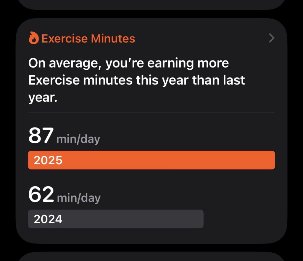
Screenshot of Apple Health’s average exercise minutes highlight.
Supposedly, I have “earned” more exercise minutes than last year. I wasn’t surprised to see the numbers, I wasn’t as good of a runner in 2024, but I was surprised with the wording.
This gamification of health and fitness is a long term trend that I’ve noticed a lot of health tracking companies, particularly Apple, embrace over the past couple of year. Now, I understand, and partake in, setting goals for fitness, but a lot of the fields that the Apple Watch allows you to set goals for don’t make sense to the average person. For an example, the Fitness app reads some basic data from the watch to create daily statistics called “rings.”

Screenshot of Apple Health’s average exercise minutes highlight.
For those who don’t have an Apple Watch activity rings are Apple’s way of doing daily goals. You have three categories: move, exercise, and stand. Move is the number of active calories you have burnt, exercise is the number of minutes you have been sufficiently active for, and stand is the count of hours in which you have stood for at least one minute within. Now, since I got my first fitness tracker, a bright orange Fitbit Charge HR, I have really enjoyed the idea of daily goals, it seemed like a really unique perspective that only a device which actively tracks your health and fitness could do, but, these metrics don’t feel meaningful to me.
First off, the default values don’t make sense, in the screenshot above I have changed them to best match the publications on health and fitness that I have read, but how they’re measured also don’t make sense. For an example, according to the Harvard Heart, we should, for ideal heart health, get at least 30 minutes of moderate-to-vigorous activity per a day and stand for, at least, 2 total hours within a day. They also found that more vigorous work could be substituted for less vigorous work, so a 20 minute jog counted as multiple minutes of standing.
I think that this is a crucial part that most fitness platforms don’t seem to get right, health doesn’t look the same for any two people. In fact, health doesn’t look the same for the same person on any two days, people who are frequently active are supposed to have a day of rest to allow the body to repair itself. On these days Apple Health frequently tells me “you’re burning less calories than you normally do at this point,” which, given that exercise is addictive (which is an emerging field of study with many different classifications and looks very different depending on the person) these kinds of prompts from an app do nothing but promote those ideas.
There is one platform, Garmin Connect, which I think does this idea of goals correctly. It’s equivalent of active minutes is on a weekly basis, and other daily goals are digestible and easy to understand (ie. steps, sleep, etc.), which, in my opinion, is a healthier balance. Garmin Connect doesn’t provide health “warnings” or bombards you with “trends,” now that does mean you have to know where to look for features that may be hidden away and discovery is harder. Now, I do have complaints about Garmin Connect, but those are for another time.
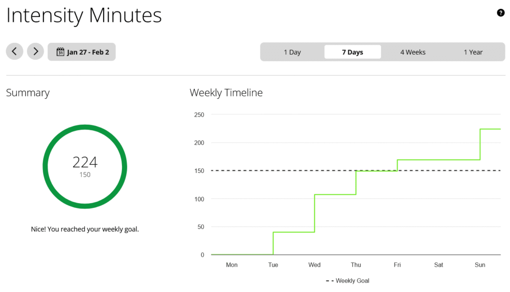
Screenshot of Garmin Connect’s intensity minutes feature.
I’d also like to praise HealthFit, my personal favorite fitness app, which provides very detailed statistics, with explanations and sources on how they are calculated, what they mean, and how you can use them, but no praise or critiques about your trends or history.
I think that this is a good overview of where I feel the state of health and fitness app user experience design is going: telling you if you are doing good or bad, with no context on who you are or what is going on around you. I really don’t like the idea of this, I feel that fitness platforms should aggregate the data that helps you better understand what is happening in your life and body, not what should be happening or where your goals should be. After all, goals and life changes, and that’s fine, and getting stressed out over what an app tells you isn’t going to help at all.
Also: I’m currently working on a self-hosted fitness platform, it’s just an experiment right now and we’ll see where it goes, but if you have any comments on where you think that should go feel free to reach out to me.